File Formats and Resolution
For raster, PNG and PSD with transparent background work well; we also accept PDF. Vector AI, SVG, EPS — best for logos: scale without sharpness loss. Raster guideline — about 300 DPI at real print size. For an A4 chest that is roughly 2480×3508 px. A social-media image often stretches and blurs edges — better send the maximum-quality source. A source with pixel headroom is always better to downscale than to "rescue" a soft image.
Color, Contrast, and Underbase
DTF technically prints CMYK, but we convert RGB files ourselves. For screen, if brand shades matter, give Pantone or exact references. A light print on dark fabric needs a white underbase — otherwise color sinks. Avoid lines thinner than 0.5 mm and tiny text on a large area: they disappear first in print and wash. A color reference on fabric beats a theoretical profile, especially for brand shades. If unsure — compare two quotes on the same artwork.
Size, Margins, and Placement Zones
Typical zones: chest about A4, back A3, sleeve A6 — exact sizes are agreed per model. Leave 2–3 cm from seams, kangaroo pocket, and hem: otherwise part of the art goes under stitching. State in the message where the print should sit. On hoodies we account for the hood and fleece thickness. Clearer placement specs mean fewer pre-launch revisions. A centimeter placement map removes half the revisions before color correction. In practice this nuance shows up more often at the fitting of a finished batch.
Artwork Nuances by Technology
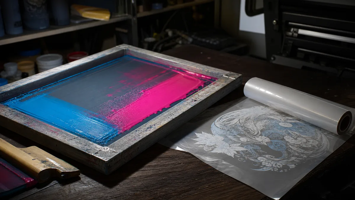
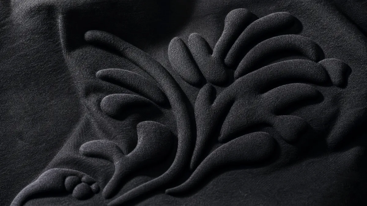
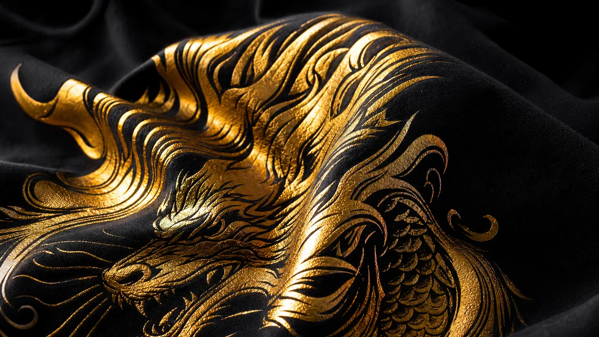
Screen loves clean solids and a limited color count. DTF calmly handles photos and gradients. Vinyl needs cuttable contours — no thin "islands" that fall off when weeding. Puff and foil read better on enlarged forms. If you plan a method combo, split elements by layers early: what is flat, what is raised, what is metallic. Splitting by technology at the file stage saves rework when effects are already approved. On batches of dozens, such details show more than on a single sample.
Common Client File Mistakes
Most common: low resolution, background not removed, logo embedded in a screen photo, text not outlined. Another error — a huge print "seam to seam" on a thin tee. We catch this on check and suggest free fixes, but a correct file from the start is better. The cleaner the source, the closer the result to what you see on monitor. Checking for thin lines and tiny text is a quick filter before any paid run. For Tashkent this is a normal working setup without theatrical service copy.
No Artwork — How Choice Print Helps
Send a logo in any form or describe the idea: a designer preps print artwork free. Usually we assemble a basic file in 1–2 hours during business hours. Message @dkretov or call +998 90 349 03 64. We also check your finished file before the run and flag where detail may be lost. You launch print deliberately, not on luck. Even a rough logo is better sent now: adapting for print is easier than waiting weeks for a perfect PSD.
Summary
Good artwork saves money and nerves: less reject, more accurate color, cleaner edges. Follow DPI, margin, and technology rules — or hand prep to us. Choice Print in Tashkent checks files before print and helps bring design to a working state free.