
White tees: light, color and “air”
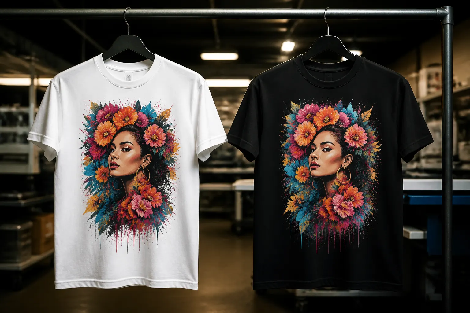
On white, inks look closer to the on-screen artwork, especially pastels and light gradients. Fine details read easier and the composition feels lighter. For kids prints, illustrations and corporate marks with complex palettes, white is often safer. Downside — dirt shows more, especially in kitchens and promo giveaways. If the logo is dark, a white tee gives classic contrast without needing an extra white underbase in the print. At Choice Print in Tashkent we will match the option to your artwork and run size.
Black tees: contrast and attitude
A black carrier makes bright colors cinematic and white or neon text maximally readable from afar. For streetwear, music and evening events, black is almost default. But light elements on dark fabric need a correct white underbase in DTF or a separate white screen pass — otherwise color sinks. Tiny gray on black can vanish. Everyday stains are less dramatic on black than on white. At Choice Print in Tashkent we will match the option to your artwork and run size.
How fabric color affects technology
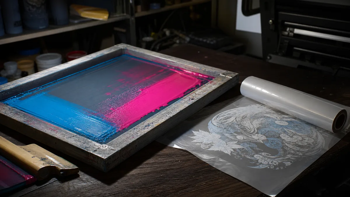
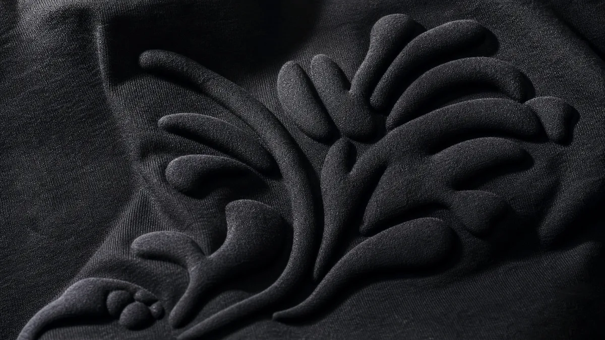
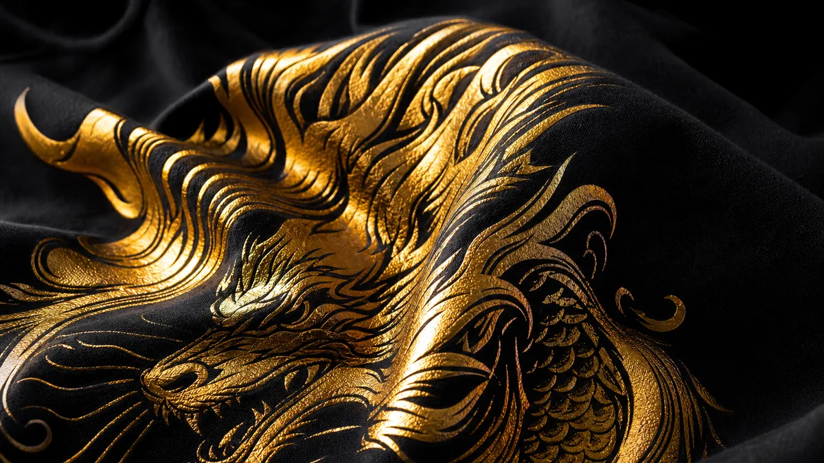
DTF works confidently on white and black thanks to the white layer under the image. Screen on dark needs a planned color sequence and sometimes an underbase. Vinyl on black looks great in white, silver and fluorescent films; on white — in rich darks. Puff and foil are especially striking on black. 3D elements also benefit from a dark ground. We will say if the artwork should be simplified for the chosen garment color. At Choice Print in Tashkent we will match the option to your artwork and run size.
Contrast, print size and readability
Simple rule: the print should fight the background in lightness or hue. Navy on black without an outline is a risk. Beige on white is too. Sometimes a stroke or plate helps. On oversized black tees a large light A3 on the back looks powerful; on white a clean colorful A4 often wins. Before the run, view the art on a background color model, not only on a transparent PNG. Choice Print can preview placement. At Choice Print in Tashkent we will match the option to your artwork and run size.
Care and wear in Tashkent climate
White garments need careful washing against dust and deodorant marks; do not overuse bleach — it hits the print. Black shows less dust but can fade in harsh sun and boiling water — keep 30–40°C and wash inside out. In heat people prefer light fabrics; for winter and evening drops — black. For street and service uniforms, discuss color practicality together with design, not separately. At Choice Print in Tashkent we will match the option to your artwork and run size.
How to decide and place the order
Ask where the piece will be worn and what emotion you want. Corporate day — often white/colored; street drop — often black. You can split a run 50/50 and watch demand. Send artwork to @dkretov or call +998 90 349 03 64 — we will show how the design sits on both colors and suggest DTF, screen, vinyl, puff or foil. Tashkent delivery and pickup after QC. At Choice Print in Tashkent we will match the option to your artwork and run size. Message @dkretov or call +998 90 349 03 64 for timelines and technology advice.
Summary
A white tee reveals color and detail; a black tee boosts contrast and attitude. The choice depends on design, audience and wear scenario — not taste alone. Choice Print will help compare both options on your artwork before printing.